Wednesday, March 29, 2017

What is it

This week in class we were learning how to create custom shapes in photoshop. Some of the preset shapes that come with photoshop don't have the shape that we need in order to create an image. We used the pen tool and created our shapes. I had trouble creating a smooth and rounded shape, so i just made an outline of a shape that I wanted to create. When I had the outline that I wanted I went to Edit, Define Custom Shape. This created the shape and when I would go under the custom shape tool my shape was there and all I had to do was click on it. I did this to create the body, head, legs, ears, and tail.


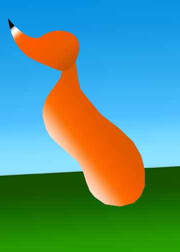
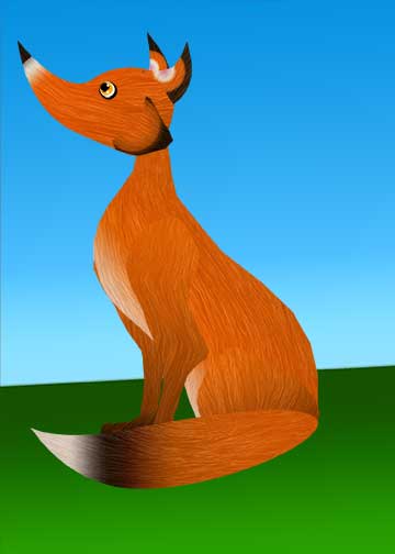
I then selected each body part and used the gradient tool to give the body parts some definition. I even used the gradient tool to create that landscape that the fox would be in. 


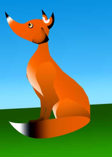
After creating the fox I then went online and found an image of fur that i really liked and added it to the image. I would add the image and made it a layer above the body part that I wanted to add fur over. I used the Puppet Warp tool and the Warp tool the create the direction that I wanted the fur to go. Once that was done I would go to the body part layer, select the area around the body part, then go back to the fur layer and pressed delete. Now the only area with fur is just the body part. I then lowered the opacity of the fur layer so that it would still have the gradient of the fox's body part and still show some texture. 

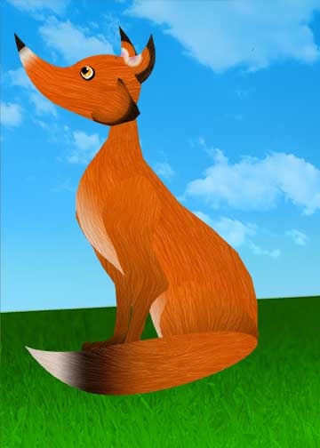
After this I found a grass image and sky image with clouds that i liked and did the same thing that I did with the fur to give it more dimension and change the layer from normal to overlay. 


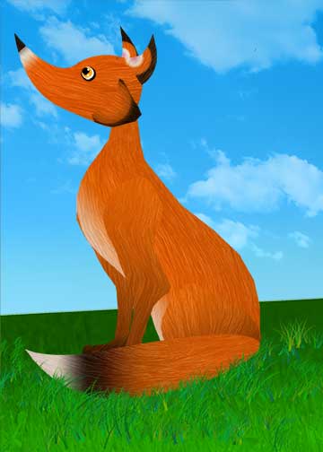
The last thing i did was used the brush tool and used the paint brush that looks like a patch of grass and a blade of grass. I painted around the fox to make it look a little more realistic and doesn't look like the fox isn't just pasted there. I love the contrast of colors of the blue and the orange, it makes it pop out. I also like the different textures so that it doesn't make the image look to flat. 

What is it, Digital, Photoshop CC 2017


Monday, March 20, 2017

Another World

I wanted to create a surrealist piece and I had the idea of a chapel on the cliffs looking out into the ocean. I found an image of some cliffs and i selected the water and the grass and used the hue and saturation filter to change the colors. I wanted it to be colors that wouldn't be found naturally in the real world. 


I then proceeded to add the image of the chapel that I created in photoshop. I knew that it was going to be sunset in my piece so I added some shading and a filter to create the depth and contrast on the building making it look like light was hitting it. In the windows of the chapel i selected them and used the gradient fill tool to make the reflection of the sunset on the windows.


After this I selected the sky and used the gradient tool to create what the sky would look like during sunset. I then brought my opacity down 50%.


I then added some planets into the sky changing their opacity and using filters to affect the color of the planets and make it look like you can see the atmosphere. I then added some tentacles of an octopus come out of the water because i wanted there to be something lurking in the water. I used the hue/saturation filter again and change the colors of the tentacles from red to green. I did this so they would contrast against the purple/pink water. I then added some splashes of water around the tentacles to make it a little bit more realistic. I also wanted something magical to happen. So i added a forest line and changed the color of it to blue and added white specks around the forest and vegetation to make fairy dust or something along the lines of that come out from it.


I decided to go back and fix some things in the piece. I made it to where the church isn't so straight on the ground and made it look like grass was growing around the church. This is to make it a little bit more realistic and not look like it was just "cut and pasted" there. I then decided to change the planets. I moved the planets around and replaced the pink planet with something that had more of a contrast. I also decided to change the forest. Instead I used the "Render" on the filter window and I was able to make several different trees. 

Another World, Digital, Photoshop CC 2017.

The Chapel Point Perspective


 Over the past few weeks we have been working on making a point perspective and making a surrealist composite.

The first step was making a building by using perspective. I found an image that I would like to recreate. i followed the line of the building and found the points where they intersected. I then proceeded to use this as a guide to find all my other lines and eventually created the building.  
I then selected the walls that I know that i wanted to color and filled them as a base color for later when i add in more detail and put them on a new layer. I had to lower the opacity of the original image and draw the outlines of the top of the windows since they have a curve to them. 

Afterwards i created a new layer and began painting in more details and created stones and wood details.

The Chapel, Digital, Photoshop CC 2017.

The final product the image has lines, and texture and repetition. 

Sunday, March 5, 2017

Lichtenstein Self Critique

Disconnect, Digital, Photoshop CC 2017.

In this piece, there's an image of a woman being held by her significant other while she is holding a phone. With it we see the message she is receiving and sending. There is a lot of line, movement, texture, and the use of muted and bright colors.  The shape and pattern of the dots being repeated on the skin, nails, eyes, and phone create rhythm. We can see that she seems more interested by her phone than just being in the moment with her loved one. The colors seem to be more muddled but the phone and text bubble are the only ones that are a bright neon color emphasizing the importance of the phone compared to everything else. The title is called disconnect and the image depicts on how disconnected she is emotionally by the way she's looking at her phone and her tone in her text seeming bored. This piece is inspired by Roy Lichtenstein's work and is recognizable but is still different by making a piece that is more modern compared to his works.

Polygon Deer Self Critique


Polygon Deer, Digital, Adobe Illustrator 2017.

This is a composite of different polygons coming together to form the image of a deer. The polygons come in different shapes and and sizes to help create the images while making the outline of the deer as smooth as possible. The shape of the polygons gives it a sharp hard texture. There is a lot of rhythm and movement with the polygons. The lines of the edges of the polygons leads your eyes to different areas and the colors gives it contrast. The smaller and lighter color polygons gives more contrast and different textures by creating the small spots the deer has. There is a balance with the photo. The top part of the deer is more busy with the smaller polygons interpreting the spots while the bottom part of the deer isn't as distracting. The title is an exact representation of this piece. I like how this piece is like a contrast. The deer is like a delicate and elegant creature and to me is calming and peaceful, while the the polygons that make up the deer makes it harsh and sharp. I feel like this piece is more of a decorative piece that you would see as decoration in someones room. I think just the different geometric design is what sticks to in your mind because its different. Its not just a plain deer, but looks like broken or stained glass.