Wednesday, May 3, 2017

Fake It

For this piece, when I found this image online, I knew what direction that I wanted to go with it. I liked the care free look on her face and how she was in a tree. Sometimes we feel like the world is against us but we put on a happy face and don't let anyone know how we really feel. I felt like with this I could accomplish that feeling and just to hold on to something when we feel troubled. For this one, I started off with selecting the area below her which was a patch of a long leafed plant. I wasn't sure exactly if I should use flames or broken glass. When I added in those photos, and removed the areas that weren't selected, I looked to see which image of fire or glass looked better. I felt like the flames contrasted more than the glass did, so I selected that one. 


Next I decided to add some storm clouds and lightning for more of an effect on the tone of the piece. I went ahead and added the photo on another layer and then changed the opacity of it to about 30%. I then went around with the eraser tool and erased the storm picture where the balcony of the building is, the palm tree and the circular sculpture. When that was done I brought back the opacity to 100%. 


I also decided last minute to get rid of the ground. I found an image of space and used that to make it feel like if she were to fall, there's no way back out. I put the space image did the same thing to it that I previously did on the storm image. I made sure that this layer though was below the fire layer so it wouldn't be in front of it.

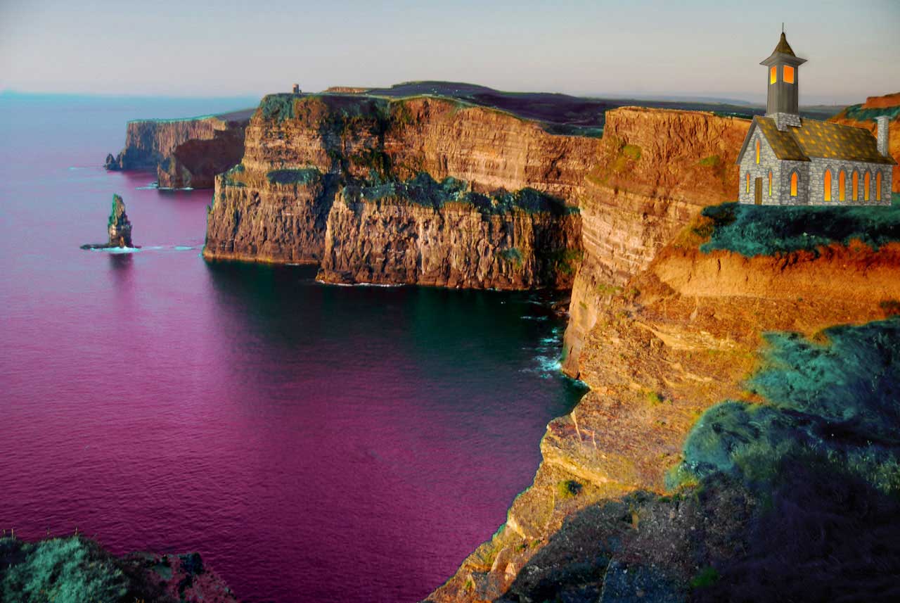
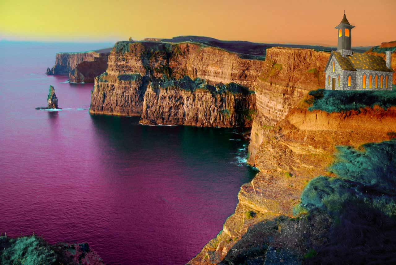
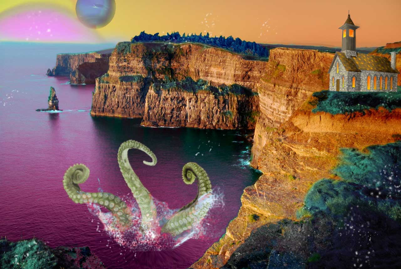
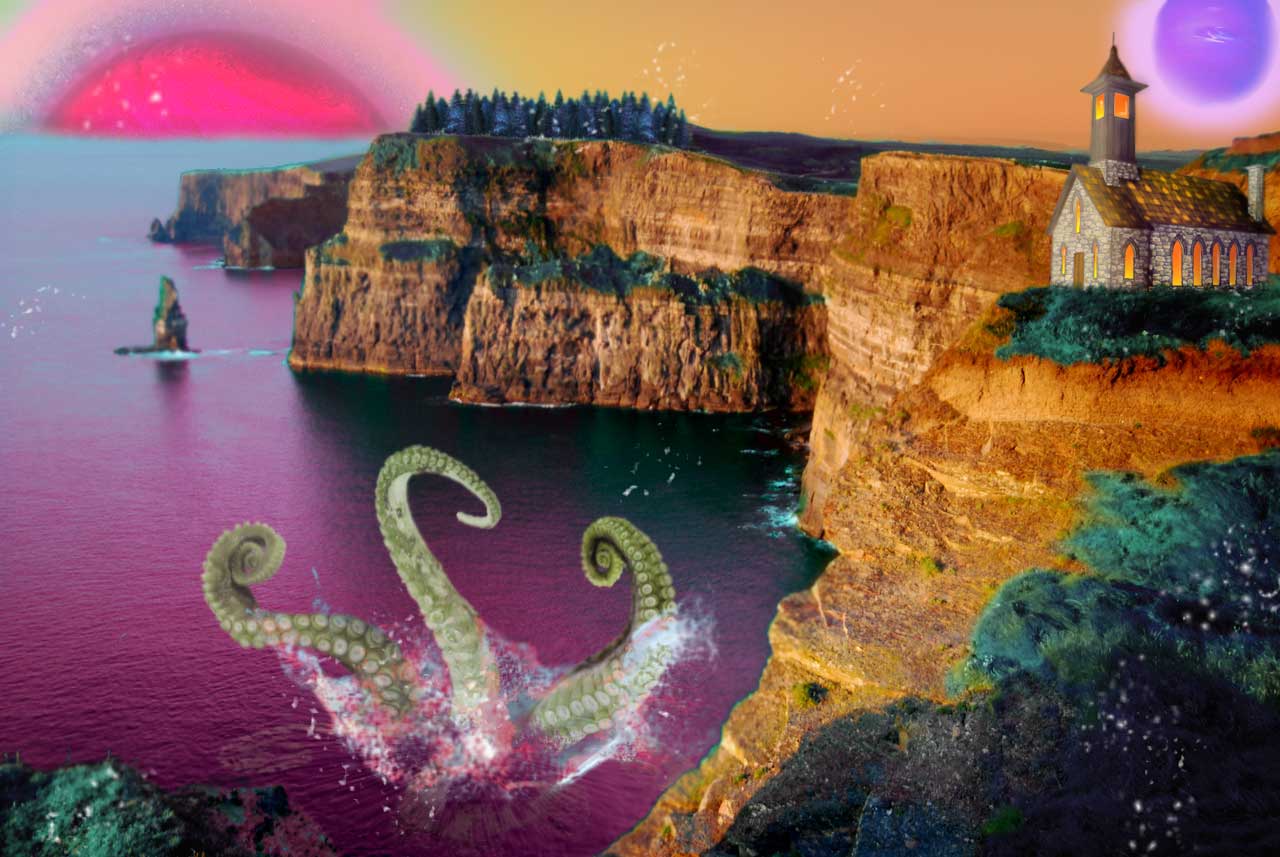
Fake It, Digital, Photoshop CC 2017.

Biker Gang

This time I found a vintage photo online with girls on some motorcycles. I decided to make the wheels of the bike colorful donuts. I chose these donuts because I figured it would be a nice contrast and bring the viewers eye towards the subject against the black and white background.


I felt that this still needed something else. So I found photos of sprinkles and gummy bears to cover the body of the motorcycles. I kind of like this. I figured that back in the day women might not have been viewed in good light if they were on a motorcycle. It was probably not feminine enough. So I added sweet to show off that tone. 

Biker Gang, Digital, Photoshop CC 2017

Monday, May 1, 2017

The Dress

I decided to move from rooms into other subjects. This time I found a vintage photo of someone. I wanted to change the dress and found a floral pattern. Then I selected the area around the dress and went to the floral pattern layer and deleted that selected area.


After this I did select the area where there is some fabric that is tied around the dress. I found a picture of doillies  that were all different colors and formed a ring. I was going to add that where the fabric layer but decided not to because it was hard to tell what it was and was too busy. I really do love the photo just with only the floral pattern but I chose to add a little bit more. In the background where you see the street, I selected that area and brought in a picture of autumn leaves. I thought it would be a nice contrast from the spring like floral pattern on her dress. I was also going to put the autumn scenery in the window by the woman. But when I did this, I felt like it took away from the photo and decided to just keep the autumn scenery in the street. 

The Dress, Digital, Photoshop CC 2017.


Wednesday, April 26, 2017

Opposite

In this room, I noticed that this is a modern room and everything is slick and smooth lines. I wanted to change that and add areas of this place with texture and movement. 


Opposite, Digital, Photoshop CC 2017.

Reflected

I decided to make something similar in process that I've done in high school. I created a room and cut out magazine pages to fit the walls, ceiling, and furniture for the room. So I did the same idea but digitally.

First I found an image of a room that inspired me to create this room. I then outlined in a new layer each section that I was going to put in each area.

I wanted to the stars on the ceiling, but I knew I wanted a cluster of them near the area where the chandelier was. This to give it some effect that the lights from the chandelier was reflecting off into the sky.

I proceeded to do this to every area that i wanted to change. So I added a green scenery. And decided to show the opposite of that in the walls.


I wanted to change the rug into something different. I didn't want to do something dealing with nature though. So I chose a swirl of table cloths in different colors. 

Then I finished changing the walls. 

Reflected, Digital, Photoshop CC 2017.


Wednesday, April 12, 2017

3D Dog Eye

The next thing we tried to make was a 3D eye in photoshop. In the 3D tab we created and sphere from mesh and I decided to keep the light source in the front of the eye. Then I flattened the sphere and duplicated it making a smaller sphere.

I selected the inner sphere and with the color balancing tool changed the colors to a orangish brown color. 


Afterwards I created a circle to make the iris and pupil of the eye. Then I used the gradient tool and filled it in to create the eye color and the pupil. Then on the bigger sphere that we made first I used the levels tool to create the darker area around the eye. 

I wanted to make the eye a little more realistic and detailed so I created a new layer and used a round fan stiff thin bristle brush and added highlights and shadows around the iris. 


I then decided that i didn't like the second sphere that was smaller so i decided to get rid of it. I then added light reflection on the eye and decided to go ahead and make the area of the dog around the eye. I used the line tool to create where the skin meets the eye and warped it to make all of the curves. 


Then I selected the area around the lines and in a new layer filled it with the color black. Then I colored around the eye with a brown color to give a base coat for the skin since dogs have less hair around their eyes. I then created a shadow on the top part of the eyes to give it some depth from where the brow bone of the dog is. 


I then used that same brush from earlier on the iris for the fur. I used grays, browns, and black brushing in the direction that the dog hairs grow. 


Then I created a new layer and used pinks and the same brush to create the fur and skin around the areas around the eye. 


Then after all of that I used the Gaussian Blur filter to blur everything out. 


Dog Eye, Digital, Photoshop CC 2017

3D Dog nose

This week in class we were making 3D objects in photoshop. The first one that I made was a dog nose. In the 3D tab I created a cone from mesh and moved the toggle around to change the direction of light. Then I flattened the image and made the cone more softer and getting rid of the point with the puppet warp tool. Then I proceeded to add layer upon layer of color to color in the nose. The texture of dogs noses reminds me of cobblestones. So I found an image online and turned the opacity down and changed the layer from normal to linear light to get the details of the pavement to create the texture of the nose.


Dog Nose, Digital, Photoshop CC 2017

Monday, April 3, 2017

Blue Girl

Today we made Picasso inspired art. My favorite pieces that he has done is the Old Guitarist piece. Blue is my favorite color and I also relate it to a song that I loved when I was younger called "Im Blue" by Eiffel 65. But that isn't the only reason why I like this piece. I've learned that one of the reasons why during Picasso's blue period was what it was because back then paint was expensive to buy and that blue paint could have been the only paint he had or was the cheapest to buy. This to me would kinda be depressing if you didn't have any money.This would also tie into the feeling, his Blue Period gave off. I was also fascinated to find out that under the Guitarist painting, is another painting. There is a possibility that he didn't have any money and so he had to resort to painting over one of his other pieces. Thats why I was inspired to make a piece like this. 


What I did was used a frontal profile photo of myself and then in a new layer and added a side profile picture of me. The side profile picture, I changed to opacity of the image to 50% and then tired to line up my face as best as I could. 


Afterwards I created a new layer and outlined myself with the paint tool. 


Then I selected different areas and filled them with different shades of blue. Then in the background I used the gradient tool and filled it in with different shades of blue. 


Then I went to the filters and in the stylize tab I used the Oil Paint filter on the whole image. 

Blue Girl, Digital, Photoshop CC 2017.

Wednesday, March 29, 2017

What is it

This week in class we were learning how to create custom shapes in photoshop. Some of the preset shapes that come with photoshop don't have the shape that we need in order to create an image. We used the pen tool and created our shapes. I had trouble creating a smooth and rounded shape, so i just made an outline of a shape that I wanted to create. When I had the outline that I wanted I went to Edit, Define Custom Shape. This created the shape and when I would go under the custom shape tool my shape was there and all I had to do was click on it. I did this to create the body, head, legs, ears, and tail.


I then selected each body part and used the gradient tool to give the body parts some definition. I even used the gradient tool to create that landscape that the fox would be in. 


After creating the fox I then went online and found an image of fur that i really liked and added it to the image. I would add the image and made it a layer above the body part that I wanted to add fur over. I used the Puppet Warp tool and the Warp tool the create the direction that I wanted the fur to go. Once that was done I would go to the body part layer, select the area around the body part, then go back to the fur layer and pressed delete. Now the only area with fur is just the body part. I then lowered the opacity of the fur layer so that it would still have the gradient of the fox's body part and still show some texture. 

After this I found a grass image and sky image with clouds that i liked and did the same thing that I did with the fur to give it more dimension and change the layer from normal to overlay. 


The last thing i did was used the brush tool and used the paint brush that looks like a patch of grass and a blade of grass. I painted around the fox to make it look a little more realistic and doesn't look like the fox isn't just pasted there. I love the contrast of colors of the blue and the orange, it makes it pop out. I also like the different textures so that it doesn't make the image look to flat. 

What is it, Digital, Photoshop CC 2017


Monday, March 20, 2017

Another World

I wanted to create a surrealist piece and I had the idea of a chapel on the cliffs looking out into the ocean. I found an image of some cliffs and i selected the water and the grass and used the hue and saturation filter to change the colors. I wanted it to be colors that wouldn't be found naturally in the real world. 


I then proceeded to add the image of the chapel that I created in photoshop. I knew that it was going to be sunset in my piece so I added some shading and a filter to create the depth and contrast on the building making it look like light was hitting it. In the windows of the chapel i selected them and used the gradient fill tool to make the reflection of the sunset on the windows.


After this I selected the sky and used the gradient tool to create what the sky would look like during sunset. I then brought my opacity down 50%.


I then added some planets into the sky changing their opacity and using filters to affect the color of the planets and make it look like you can see the atmosphere. I then added some tentacles of an octopus come out of the water because i wanted there to be something lurking in the water. I used the hue/saturation filter again and change the colors of the tentacles from red to green. I did this so they would contrast against the purple/pink water. I then added some splashes of water around the tentacles to make it a little bit more realistic. I also wanted something magical to happen. So i added a forest line and changed the color of it to blue and added white specks around the forest and vegetation to make fairy dust or something along the lines of that come out from it.


I decided to go back and fix some things in the piece. I made it to where the church isn't so straight on the ground and made it look like grass was growing around the church. This is to make it a little bit more realistic and not look like it was just "cut and pasted" there. I then decided to change the planets. I moved the planets around and replaced the pink planet with something that had more of a contrast. I also decided to change the forest. Instead I used the "Render" on the filter window and I was able to make several different trees. 

Another World, Digital, Photoshop CC 2017.

The Chapel Point Perspective


 Over the past few weeks we have been working on making a point perspective and making a surrealist composite.

The first step was making a building by using perspective. I found an image that I would like to recreate. i followed the line of the building and found the points where they intersected. I then proceeded to use this as a guide to find all my other lines and eventually created the building.  
I then selected the walls that I know that i wanted to color and filled them as a base color for later when i add in more detail and put them on a new layer. I had to lower the opacity of the original image and draw the outlines of the top of the windows since they have a curve to them. 

Afterwards i created a new layer and began painting in more details and created stones and wood details.

The Chapel, Digital, Photoshop CC 2017.

The final product the image has lines, and texture and repetition.